High-velocity onboarding optimization
Overview
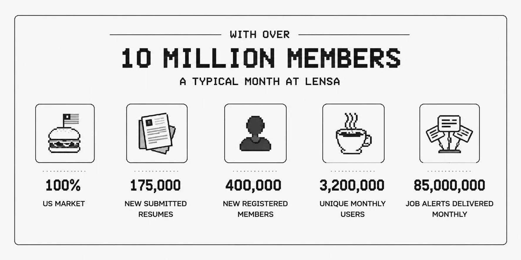
Lensa is a high-volume US job marketplace operating in a competitive user acquisition space. The core acquisition engine relied on a legacy onboarding sequence that suffered from high bounce rates, unnecessary user friction, and unused monetization opportunities.
By reviewing session recordings, restructuring the funnel around progressive disclosure, localizing copy for the US market, and building a scalable design system, we turned the onboarding flow into an effective growth driver—achieving a +37% increase in total registrations.
The challenge and audit
The legacy flow
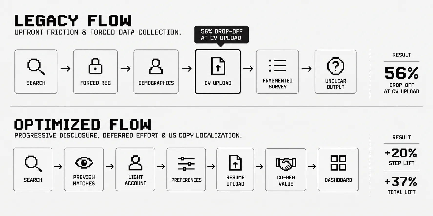
The main entry point for acquisition was a rigid 7-step onboarding sequence. Instead of helping job seekers quickly see relevant jobs, it created heavy cognitive load early in the process.
-
High upfront effort: Candidates had to fill out multiple forms before seeing any real product value.
-
Major funnel bottleneck: The document upload step suffered a 56% drop-off rate, blocking overall funnel throughput.
-
Inconsistent visual patterns: Ad-hoc UI elements reduced visual trust during data entry steps.
-
Unclear monetization: Partner subscription offers (co-registrations) were disruptive, frustrating users without generating meaningful revenue.
Key takeaway
Asking for high-effort inputs (like resume uploads or full work history) before showing value led to immediate drop-offs.
Research and user behavior
Initial visual tweaks that missed the real problem
When we first tackled the 56% drop-off rate at the upload step, we tested standard CRO tactics: changing layout arrangements, adjusting button colors, reordering fields, and tweaking form density.
None of these changes moved the needle. The funnel was still stuck because we were attempting to fix a cultural and mental model mismatch with simple visual polish.
Session analysis and user discovery
To get past guesswork, I reviewed 300+ Hotjar session recordings across mobile and desktop.
Watching how candidates interacted with the screens revealed the exact moment of friction: users repeatedly hesitated and abandoned the page as soon as they reached the file upload prompt.
The microcopy mismatch
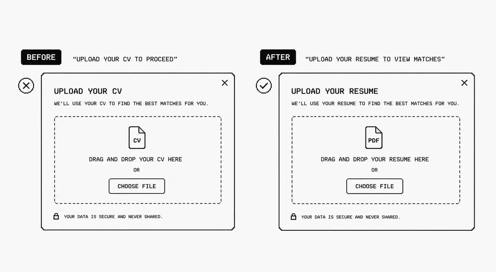
The recordings showed that the label “CV” was causing the confusion. In the US market, job seekers use the word “resume,” while “CV” usually refers to an academic or medical curriculum vitae. American users were looking for a “Resume” option, couldn’t spot one, and left the page.
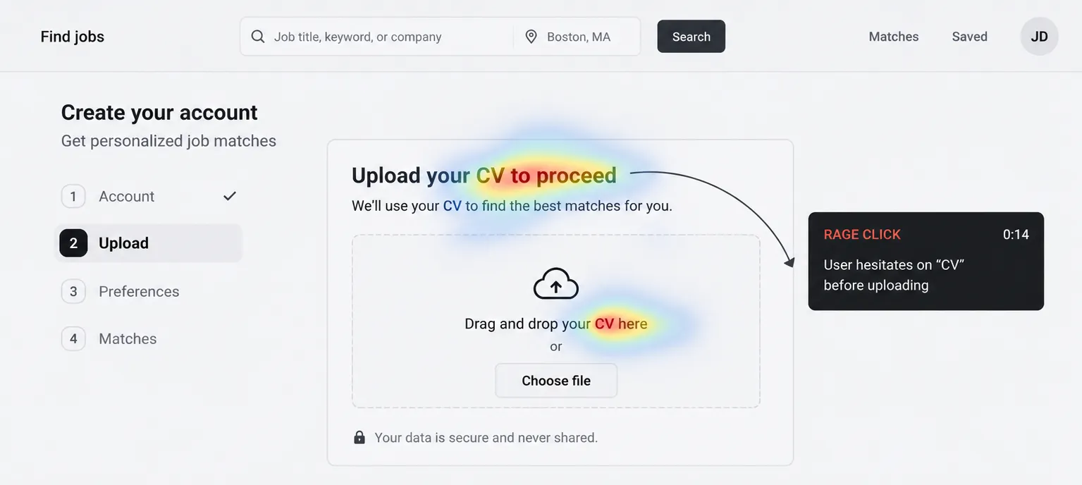
Recognizing this language gap turned a complex drop-off issue into a straightforward, high-impact copy fix.
Design changes and execution
Restructuring the funnel
I reorganized the onboarding sequence using progressive disclosure and behavioral principles:
-
Show value early: Displayed initial job matches earlier in the journey so users felt immediate value before being asked for personal details.
-
Defer high-effort steps: Moved resume uploads and detailed preference questions further back, after candidates were already invested in the flow.
-
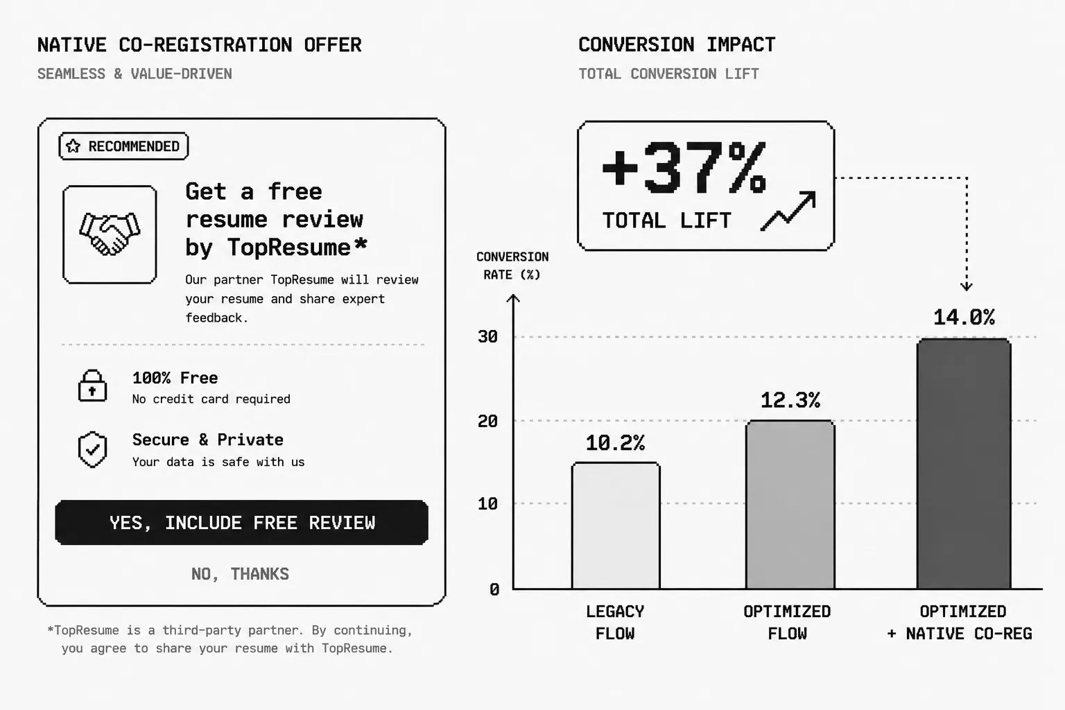
Integrate monetization naturally: Redesigned third-party partner offers as helpful, contextual add-ons rather than disruptive pop-ups.
Building the design system
To replace inconsistent legacy UI elements, I created Lensa’s first internal design system. Standardizing input fields, progress indicators, button hierarchy, and typography helped build trust and ensured a consistent brand experience across all acquisition channels.
US copy localization
We replaced “CV” with “Resume” across all microcopy touchpoints. This simple wording change removed hesitation without requiring complex backend updates.
Results and business impact
-
+37% total registration lift: Delivered by combining progressive disclosure, modern UI standards, and a streamlined flow structure.
-
+20% step-level lift: Updating “CV” to “Resume” yielded an immediate 20% conversion boost on that specific step.
-
Funnel bottleneck resolved: Cleared the 56% drop-off point that previous UI redesigns failed to fix.
-
New revenue stream: Successfully added third-party co-registrations into the flow without hurting core completion rates.
-
Higher completion quality: Raised overall profile completion rates and data accuracy by reducing perceived user effort.
Key takeaways
-
Qualitative data beats guesswork: When visual tweaks like color or layout changes fail, session recordings reveal how users actually think and read.
-
Word choice directly affects conversion: A single term out of alignment with local terminology can cause drop-offs across millions of visits.
-
Trust comes before data collection: Users won’t share personal or career info if the interface feels unpolished or asks for heavy effort too early.
-
Design systems drive business goals: Consistent component libraries aren’t just for team efficiency—they build credibility and directly support conversion.