Enterprise loan origination redesign
Overview
Circeo is a European Lending-as-a-Service platform providing banks and financial institutions with white-label loan origination technology. The platform has two primary sides: consumer-facing credit applications for retail borrowers, and back-office management interfaces for risk officers, underwriters, and system administrators.
When I joined, the platform carried significant technical and UX debt. Onboarding was rigid for applicants, while backend screens were organized around database structures rather than practical workflows. Redundant fields and multi-tab layouts slowed down underwriting reviews, and developers spent excessive time building custom interfaces for every new bank client.
By redesigning both borrower applications and back-office tools—supported by a drag-and-drop workflow builder and a multi-tenant design system—we cut application setup time by 80%, reduced average loan approval times to 20 minutes, and freed engineers to focus on core platform development.
The challenge and audit
The borrower’s friction
For credit applicants, early versions of the white-label form felt like a rigid compliance questionnaire rather than a modern financial service:
-
High upfront effort: Borrowers had to complete lengthy income and identity verification forms before seeing any loan estimate or rate preview.
-
Manual document checks: Applicants had to upload proof of income without clear guidance on acceptance criteria, causing drop-offs mid-flow.
-
Inconsistent white-label styling: Partner bank themes frequently broke visual hierarchy and accessibility standards across devices.
Backend complexity
Behind the scenes, the operator interface was designed primarily by engineers, creating operational friction for risk teams and developers:
-
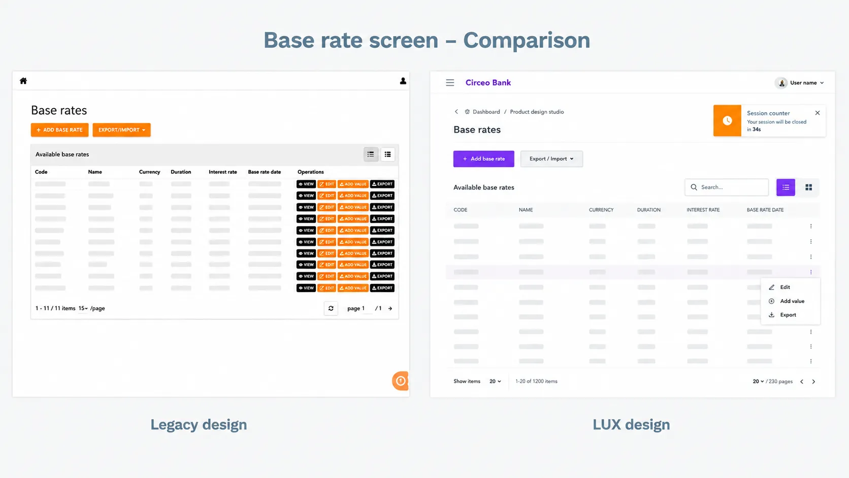
Database-driven layouts: Back-office screens reflected raw database schemas. Data fields were grouped by technical tables rather than logical underwriting steps.
-
Redundant data entry & tab hopping: Processing a loan required risk officers to switch between 5 to 7 tabs, re-entering or cross-checking the same applicant details across multiple panels.
-
Custom configuration overhead: Adjusting onboarding steps or approval logic for a new bank required manual frontend coding, turning every client deployment into an engineering project.
-
Inconsistent UI patterns: Without a shared component library, different modules used mismatched form controls, tables, and status tags.
Key takeaway
Engineering-led layout decisions increased cognitive load for underwriters, frustrated applicants, and tied up developers in ongoing interface maintenance.
Research and discovery
Shadowing underwriters and analyzing drop-offs
To understand where time was being lost, I reviewed session recordings of funnel drop-offs and interviewed bank risk officers processing live applications.
The findings highlighted three main bottlenecks:
-
Information fragmentation: Underwriters spent over half their review time cross-referencing credit scores, identity verifications, and uploaded files across disconnected sub-panels.
-
Hardcoded business logic: Changing a single field or step required formal engineering tickets and code deployments.
-
Data overload: Screens presented all database attributes at once, making critical risk indicators difficult to spot quickly.
Design execution and updates
1. Rebuilding back-office workflows (Backend & Underwriting)
We restructured the operator dashboard around actual underwriting tasks rather than database tables:
-
Unified risk review view: Consolidated applicant details, credit bureau data, income calculations, and uploaded files into a unified split-screen view.
-
Contextual data display: Used progressive disclosure to surface key credit risk factors upfront, keeping detailed audit logs accessible in secondary panels.
-
Streamlined inputs: Standardized data mapping so verified information automatically populated across all relevant forms.
2. Drag-and-drop workflow editor (Admin & Developer Enablement)
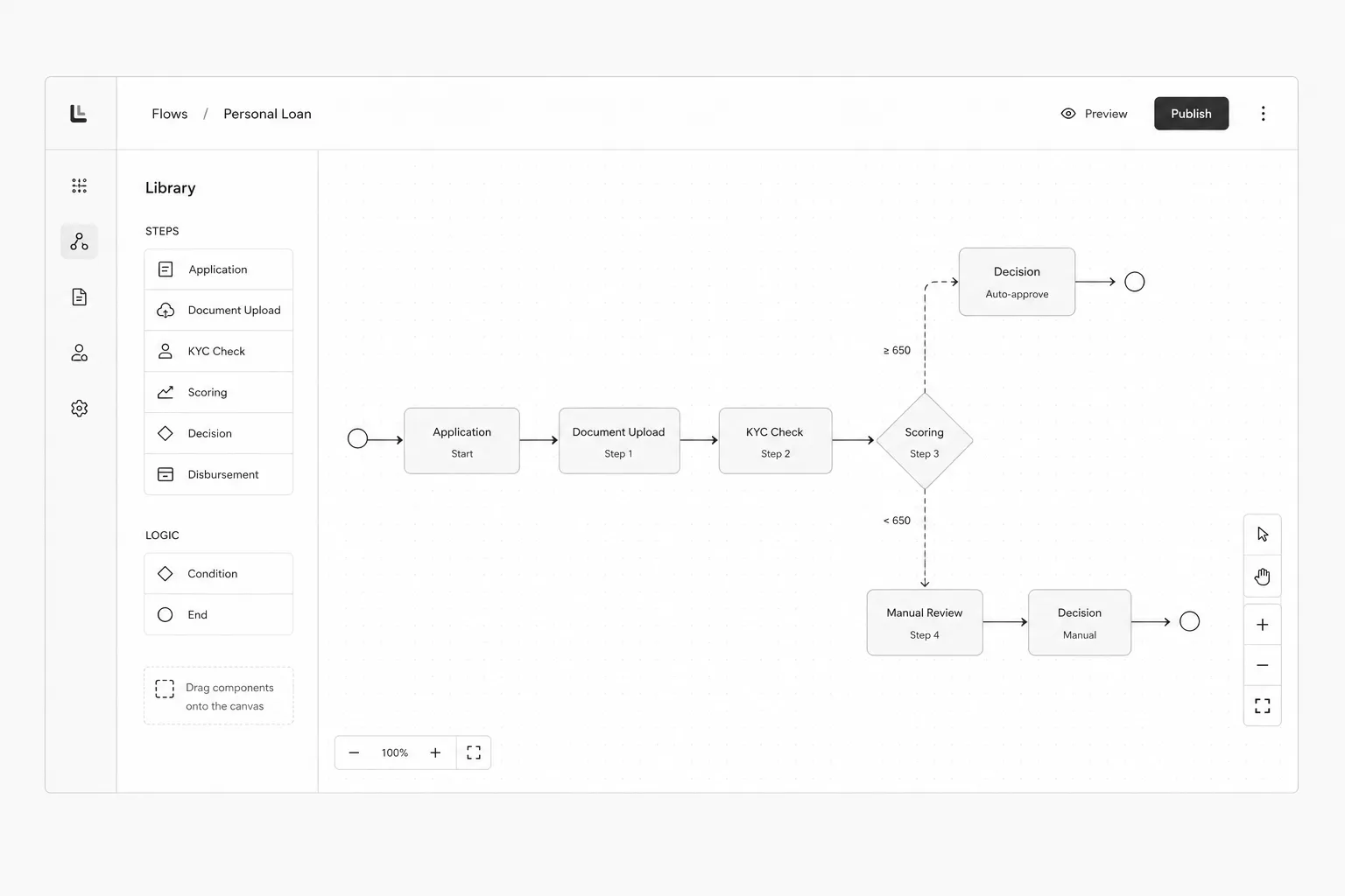
To remove developers from routine client onboarding setups, we built a visual drag-and-drop flow editor for bank administrators and risk officers.
Using this editor, client admins can visually map loan stages, insert custom form modules, and configure conditional risk logic without writing code or waiting for engineering releases.
3. Progressive borrower onboarding (Frontend Experience)
For consumer-facing application flows, we restructured the sequence around progressive disclosure:
-
Interactive loan simulator: Allowed applicants to adjust loan terms, interest rates, and monthly repayments upfront to establish value before asking for personal details.
-
Step-by-step progressive forms: Split long verification forms into short, focused steps with clear progress indicators.
-
Real-time document validation: Integrated automated parsing and instant feedback on uploaded files (e.g., pay slips, IDs) to catch errors immediately.
4. Multi-tenant design system for data-heavy UIs
To support complex financial tables, deep data trees, and white-label customization, I built Circeo’s first structured design system.
-
Data-dense table patterns: Standardized layouts for inline editing, status tags, dynamic filtering, and batch approvals across operator screens.
-
Flexible white-label system: Designed a token hierarchy allowing partner banks to apply custom typography, colors, and branding without breaking accessibility or layout integrity.
-
Developer UI library: Paired Figma component libraries with documented, production-ready frontend components.
Developer adoption and operational impact
A key goal of this initiative was improving developer efficiency. Prior to standardizing components and introducing the visual editor, backend engineers spent significant sprint capacity tweaking layouts, fixing form bugs, and maintaining custom code for individual banks.
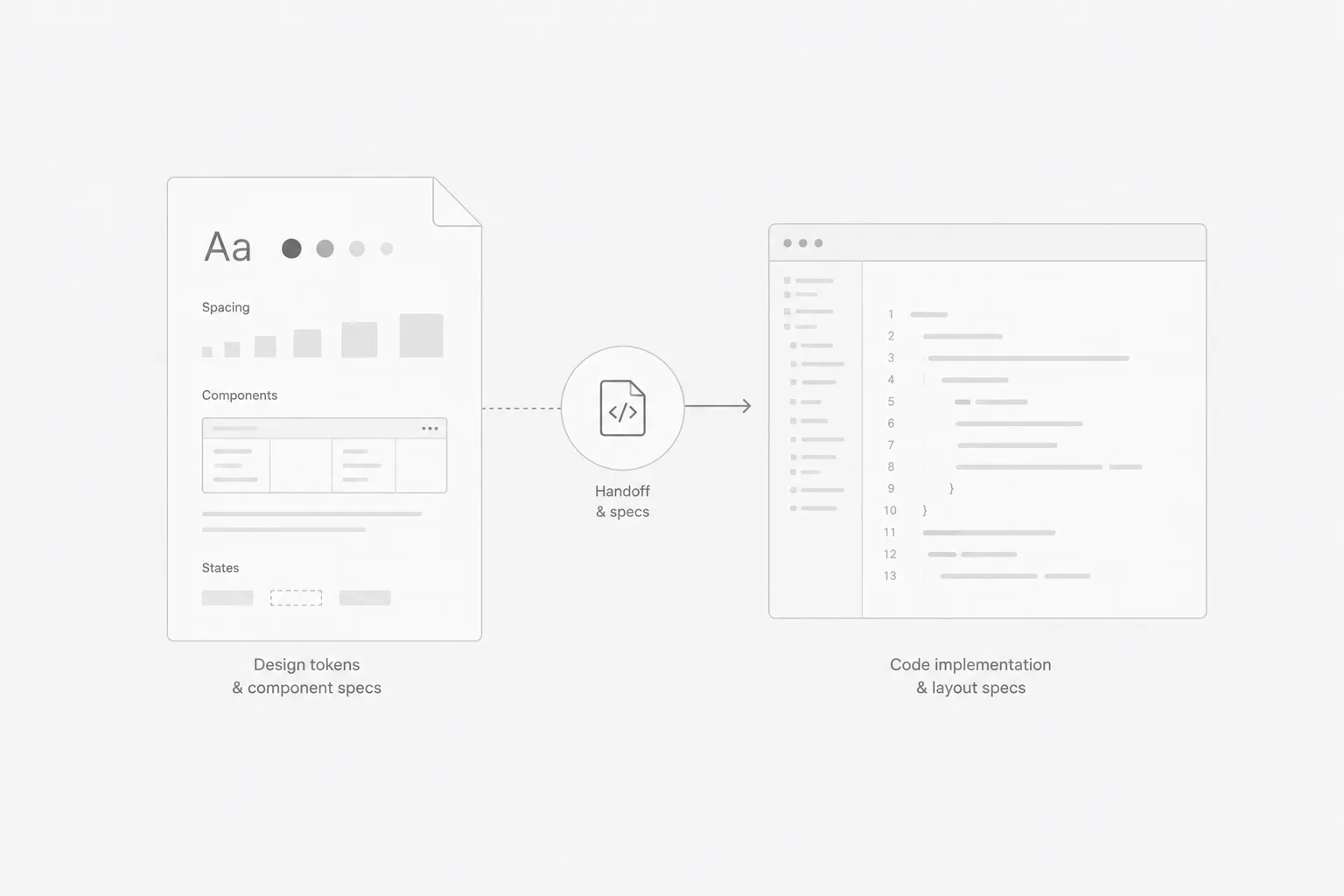
By delivering comprehensive component documentation and a shared UI library:
-
Eliminated custom CSS maintenance: Frontend components became standardized and reusable across all tenant environments.
-
Refocused engineering capacity: Developers shifted their attention to core backend performance, API response times, automated scoring engines, and security architecture.
-
Streamlined handoffs: Shared token naming and component specs reduced design-to-development review cycles.
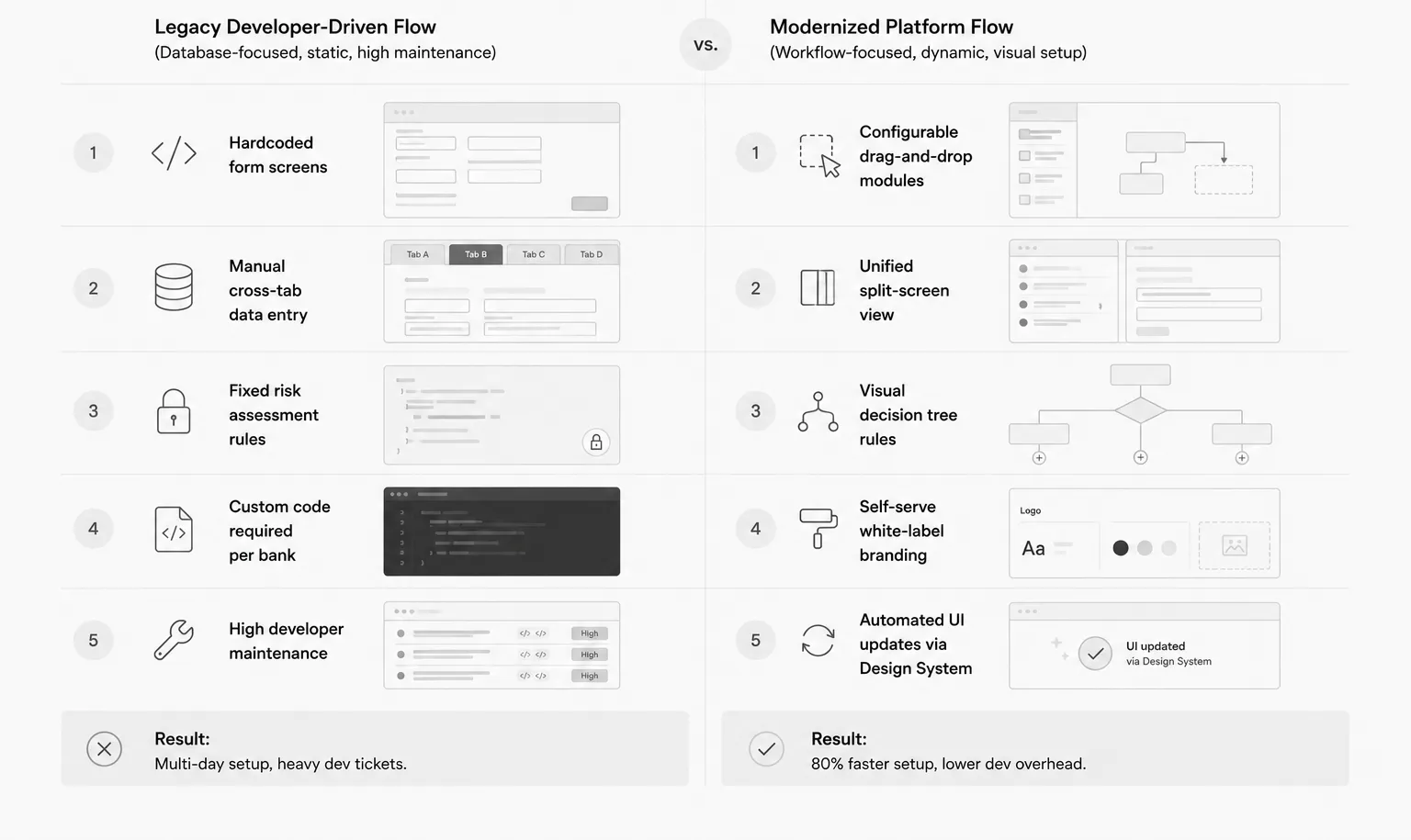
Standardized flow comparison
BEFORE
Bank Admin → Request UI Change → Engineer Codes Layout → QA → Release
AFTER
Bank Admin → Drag & Drop Blocks in Flow Editor → Instant Publish
Results and business impact
-
80% faster application setup: Bank admins can configure and launch new loan flows in hours using the visual editor instead of waiting weeks for engineering deployments.
-
70% drop in UI support tickets: Standardizing form components and clean backend logic resolved recurring interface bugs across client environments.
-
Loan approval time reduced to 20 minutes: Unifying underwriter views and streamlining borrower document checks reduced average processing times significantly.
-
Faster client onboarding: The white-label design system simplified technical integrations for new financial institution clients.
Key takeaways
-
Design for human workflows, not database schemas: Organizing interfaces around how risk officers actually review applications directly improves processing speed and accuracy.
-
No-code tooling removes development bottlenecks: Giving administrative users visual workflow editors empowers client teams and frees up core engineering resources.
-
Design systems improve engineering speed: Systematizing UI components isn’t just an aesthetic upgrade—it helps developers build and maintain code faster.
-
Clarity reduces risk in complex UIs: In data-dense financial applications, clean visual hierarchy directly minimizes operational human error.